Alugha Updates | March 2022 - what's new at alugha
Here at alugha, we love technology and leveraging it in creative ways for our users to provide unique features and a stellar experience.
we equipped our alugha video player in the way that it responds to CSS values. This can be done your CSS file (in WordPress, it is in the theme folder and in the styles.css) Add the following values:
Read this article in: Deutsch, English
Estimated reading time:0minutes
.flex-video {
position: relative;
padding-top: 25px;
padding-bottom: 67.5%;
height: 0;
margin-bottom: 16px;
overflow: hidden;
}
.flex-video.widescreen {
padding-bottom: 57.25%;
}
.flex-video iframe, .flex-video object, .flex-video embed {
position: absolute;
top: 0;
left: 0;
width: 100%;
height: 100%;
}
<div class="flex-video widescreen">
<iframe src="https://alugha.com/embed/yt/?v=mbOEknbi4gQ" allowfullscreen="" frameborder="0"></iframe>
</div>

Here at alugha, we love technology and leveraging it in creative ways for our users to provide unique features and a stellar experience.
Here at alugha, we love technology and leveraging it in creative ways for our users to provide unique features and a stellar experience.
“Management is the art of orchestrating best possible collaboration in an organization.” Where this “art” (for me) combines both, the willingness and the ability to act. Both have to be reflected in the two main areas of management: in the function “management” (the “how” and “what”) and the instit
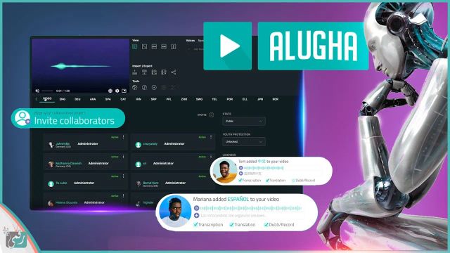
Alugha is a video translation tool that streamlines the production and collaboration process for high-quality content tailored to international audiences. Learn more at: https://appsumo.8odi.net/get-the-starter-pack You’re ready to share your videos with the whole wide world. But like a certain co
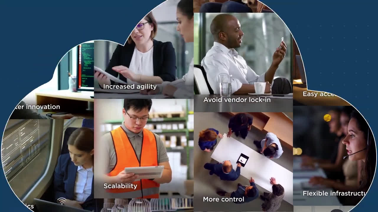
IZO™ Cloud Command provides the single-pane-of-glass for all the underlying IT resources (On-premise systems, Private Cloud, Cloud Storage, Disaster Recovery, Amazon Web Services, Microsoft Azure, Google Cloud Platform, etc). About Tata Communications: Welcome to Tata Communications, a digital ecos
A revolutionary new service in the video industry! Our report is about the unique alugha platform. Alugha gives you the tools to make your videos multilingual and provide them in the language of your viewers. Learn more about the great features of the platform here: https://alugha.com/?mtm_campaign